

If you’ve ever built a site with Elementor, you’ve probably noticed their slick Shape Dividers, those wavy, angled, or cloud‑like SVGs that separate one section from another. They add personality and flow to a page, breaking away from the rigid “rectangle on rectangle” look.
But what if you’re working in Bootstrap 4 or 5 instead of Elementor? The good news: you can absolutely recreate these dividers with a little bit of SVG magic.
What are shape dividers?
These are SVG graphics that you can place at the top or bottom of a section. Elementor makes the use of these effects easy by providing you with a drop-down list and some settings. When you set them for your section, the <path> just stretches to the width of the container on which you have them set. Some common Elementor Shape Dividers include Tilt/Angle, Waves, Clouds, Mountains, Drops/Curves.
How to Apply Shape Dividers in Bootstrap
Bootstrap doesn’t come with the shape dividers feature, however, you can do this on your website whether you are using Bootstrap 4, or Bootstrap 5. The steps are simple:
- Wrap your section (the one you want to have shape dividers on) with position:relative;.
- Place the SVG at the top or bottom of the section.
- Use preserveAspectRatio=”none” so the SVG stretches to the full width of your section.
- Adjust the fill color to match your website theme.
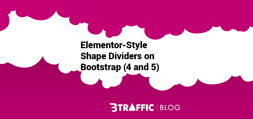
Cloud Divider
Here is an example with the clouds divider:
<section class="py-5" style="background: linear-gradient(135deg, #F5F7F8 0%, #495E57 100%); position:relative;">
  <div class="container text-center text-white">
    <h2>Bootstrap Section with Clouds</h2>
    <p>This section uses a cloud divider at the bottom.</p>
  </div>

  <div style="position:absolute; bottom:0; left:0; width:100%; overflow:hidden; line-height:0;">
    <svg viewBox="0 0 1200 120" preserveAspectRatio="none"
         style="position:relative; display:block; width:calc(100% + 1.3px); height:100px;">
      <path d="M321.39,56.44c58-10.79,114.16-30.13,
               172-41.86,82.39-16.72,168.19-17.73,
               250.45-.39C823.78,31,906.67,72,985.66,
               92.83c70.05,18.48,146.53,26.09,214.34,
               3V120H0V95.8A600.21,600.21,0,0,0,
               321.39,56.44Z"
            style="fill:#ffffff;"></path>
    </svg>
  </div>
</section>
You can change the fill color to any other color you want.
Tilt Divider
<section class="py-5 bg-primary text-white position-relative">
  <div class="container text-center">
    <h2>Bootstrap Section with Tilt</h2>
  </div>

  <div style="position:absolute; bottom:0; left:0; width:100%; overflow:hidden; line-height:0;">
    <svg viewBox="0 0 1200 120" preserveAspectRatio="none"
         style="position:relative; display:block; width:calc(100% + 1.3px); height:80px;">
      <path d="M1200 0L0 120H1200V0z" style="fill:#fff;"></path>
    </svg>
  </div>
</section>
Waves Divider
<section class="py-5 bg-light position-relative">
  <div class="container text-center">
    <h2>Bootstrap Section with Waves</h2>
  </div>

  <div style="position:absolute; bottom:0; left:0; width:100%; overflow:hidden; line-height:0;">
    <svg viewBox="0 0 1200 120" preserveAspectRatio="none"
         style="position:relative; display:block; width:calc(100% + 1.3px); height:100px;">
      <path d="M0,0V46.29c47.79,22.2,103.59,29.05,
               158,17.39C230.21,52.52,284,22.14,
               339,4.77c54.64-17.26,112.62-22.39,
               167-4.05,59.19,19.72,113.9,63.36,
               172,73.05,86,14.5,172-30,258-53.05V0Z"
            style="fill:#495E57;"></path>
    </svg>
  </div>
</section>
What’s the difference between application of shape dividers to Bootstrap 4 and 5?
I have good news for you: There is no difference in how you add SVG dividers. Both Bootstrap 4 and Bootstrap 5 support the same HTML/CSS codes above. The only thing to consider is that:
In Boostrap 4, use .container and .row as usual.
In Bootstrap 5, you can also use utilities like .position-relative and .text-center directly on sections.
So, the SVG divider code works in both versions.
How can you flip a divider and use it at the opposite side of the section?
Sometimes, you want the divider to face the opposite direction, so you can use it at the top of the section instead of the bottom, or invert a tilt so it slopes the other way. It’s simple really. All you have to do is add a line of CSS like:
.shape-divider svg {
  transform: rotate(180deg);
}
Is it possible to have multiple Elementor-Style shape dividers when using them on Bootstrap?
Yes, anything is really possible. to do so, and make things more compelling on the eyes, just place multiple <svg> elements inside the same wrapper, each with different fill colors. Here is an example:
<div class="shape-divider">
  <svg ...><path style="fill:#F5F7F8;"></path></svg>
  <svg ...><path style="fill:#495E57; opacity:0.5;"></path></svg>
</div>
This is useful when you want to create a parallax-like effect with overlapping waves in different shades. You can adjust opacity or z-index to give them more depth. You can view your changes as you update your CSS file.
How to make Elementor-style shape dividers responsive on Bootstrap
Perfection is when you are able to make it look perfect whether your users are viewing your website on desktop or mobile.
Here is some tips: Use relative units or media queries to adjust the SVG height:
.shape-divider svg {
  height: 80px;
}
@media (max-width: 768px) {
  .shape-divider svg {
    height: 40px;
  }
}
Test across platforms as you go. Bootstrap’s grid makes it easy to align with sm, md, lg and xl screen adaptations.
Don’t want to repeat inline styles for each section?
Instead of repeating inline styles, define a .shape-divider class once. Here is an example for a shape divider section appending to the bottom of the section:
.shape-divider {
  position: absolute;
  bottom: 0;
  left: 0;
  width: 100%;
  overflow: hidden;
  line-height: 0;
}
.shape-divider svg {
  position: relative;
  display: block;
  width: calc(100% + 1.3px);
  height: 100px;
}
How to use: Drop <div class=”shape-divider”>…</div> into any section and it just works. You can even extend this with modifier classes like .shape-divider–clouds or .shape-divider–waves to swap SVGs easily.
Tip: Replace bottom:0 with top:0 if you want to have a class like .shape-divider-bottom; you can also change height to make the divider taller or shorter.
If you have got questions or want help with implementing any of these, please drop a comment below. I would love to help. In this post, I tried to cover everything there is to know about how to apply Elementor-style shape dividers for your Bootstrap sections. Thank you for taking the time to read this.
Leave a Reply