
Human eyes naturally spot tiny visual errors long before the brain can explain what looks wrong. When a customer clicks from a sharp website header into a plain checkout screen, or opens an email where your logo looks stretched and fuzzy, they immediately feel a small sense of doubt. Even if they cannot name the exact flaw, these subtle cognitive frictions in branding quietly lower their trust in your business making the knowledge about Brand Touchpoints essential.
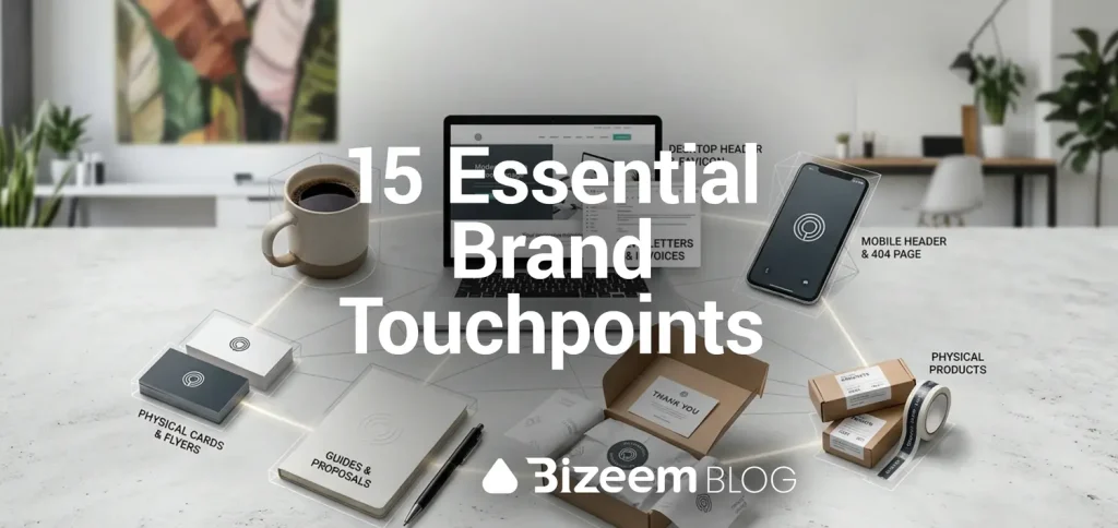
True brand consistency is not about pasting the exact same image file everywhere you go. It is about adjusting the technical details for each individual space so your visuals never look broken, crowded, or out of place. Below is a practical breakdown of the 15 most important brand touchpoints across web, email, social media, and print, along with the exact visual rules each one requires.
1. Website and App Brand Touchpoints
1. Browser Tabs and Bookmarks (Favicons)
Your favicon sits at 16×16 or 32×32 pixels right next to dozens of open tabs. Never shrink your full logo down to fit here. Use a bold monogram or a simplified symbol with thick lines and high contrast, saved as a clean SVG or crisp PNG so it stays sharp on high-resolution screens.
2. Desktop Website Headers
This is your main anchor. You have plenty of horizontal room here, so use your primary full logo lockup with your brand name and icon clearly visible. Keep plenty of empty padding above and below the logo so navigation links never crowd it.
3. Mobile Website Headers and Sticky Bars
Phone screens are narrow, and navigation bars are short. Swap out your wide desktop logo for a compact horizontal version or a clean symbol-only mark. Make sure your mobile header stays under 60 pixels tall so it does not eat up valuable reading space.
4. Login Screens, Member Dashboards, and Checkout Pages
Most business owners style their homepage and completely forget their functional pages. When a user clicks “Log In” or “Pay Now” and lands on a generic gray screen, trust drops immediately. Carry your exact header colors, button styles, and compact logo onto your login forms, user dashboards, and payment checkout screens.
5. Custom 404 Error and Maintenance Pages
Broken links happen. Instead of showing a cold, default server error message, use a simple branded page with your logo, familiar fonts, and a clear button that guides visitors back to your homepage.
2. Email and Direct Communication Brand Touchpoints
6. Newsletter Headers
Email clients block images by default for some users and shrink wide graphics on phones. Keep your email header banner lightweight, around 600 pixels wide, and use a clean, readable logo lockup that loads fast without pushing your opening sentence down the screen.
7. Transactional Emails (Receipts, Invoices, and Password Resets)
Automated system emails have the highest open rates of anything you send. Replace plain-text system templates with a clean header featuring your secondary logo, your main brand accent color for links, and clear footer contact details.
8. Personal and Support Email Signatures
Every reply from your inbox is a brand impression. Skip heavy, multi-image email signatures that turn into messy attachments. Use clean HTML text with your brand colors and a single, crisp logo mark sized around 120 to 150 pixels wide.
3. Social Media and Off-Site Brand Touchpoints
9. Social Media Profile Avatars
Platforms like X, LinkedIn, YouTube, and Instagram crop profile pictures into circles or rounded squares. Center your submark or brand icon inside the frame with generous breathing room around the edges so nothing gets sliced off by the circular crop.
10. Social Media Cover Banners
Cover banners change size depending on whether someone views your profile on a phone or a desktop monitor. Keep your main logo, tagline, and key visuals strictly inside the center safe zone so mobile screens do not cut off the left and right edges.
11. Feed Graphics, Thumbnails, and Ad Banners
When users scroll fast, they recognize layouts before they read text. Stick to two or three repeatable grid templates, use your exact brand fonts, and place your compact logo or watermark in the same corner on every post and display banner.
4. Print and Physical Brand Touchpoints
12. Business Cards and Printed Flyers
Screens use RGB light, while printers use CMYK ink. Before printing cards or flyers, convert your brand colors to exact CMYK values so your blues do not turn purple and your bright greens do not look muddy. Always send vector PDF or EPS files to the print shop.
13. PDF Proposals, Guides, and Downloadable Reports
Whenever a client downloads a PDF guide, price sheet, or contract, the cover page and running page headers should match your website. Use a clean cover layout with your primary logo, consistent margins, and your brand colors for section dividers.
14. Packaging, Shipping Labels, and Stickers
If you ship physical products or send client gifts, custom labels and stickers do not need complex artwork. A single bold ink color, a clean monogram, and high-contrast typography look far sharper on cardboard and kraft paper than detailed full-color graphics.
15. Event Banners, Apparel, and Merchandise
Embroidery on shirts and ink on promo items cannot handle tiny text or thin gradients. Use a simplified, single-color version of your logo with bold lines so it stays readable from across a room or stitched onto fabric.
How to Keep All 15 Touchpoints Connected
Trying to manage 15 different placements with just one logo file is why most businesses end up with stretched, blurry, or cropped graphics. Every touchpoint above works smoothly when you have the right pieces ready ahead of time:
- Match the Logo to the Container: Use your wide lockup for desktop headers, your compact lockup for emails and mobile bars, and your simplified icon for avatars and favicons. Building a proper responsive logo system gives you every shape ready to drop in.
- Lock In Your Exact Color Codes: Keep a simple reference sheet with your HEX codes for web and email, plus your CMYK codes for print, so your colors never drift between tools.
- Keep Your File Formats Organized: Store your SVG, EPS, and transparent PNG files in clearly labeled folders by size and background color (light vs. dark) so you never grab the wrong file in a rush.
If you are missing clean variations for several of these touchpoints and want everything built to spec, our custom brand design services can create a complete visual kit ready for every screen and print piece your business uses.
Frequently Asked Questions About Designing Brand Touchpoints
Why do my brand colors look different in print than they do on my website? Websites display colors using glowing RGB pixels, while printers mix physical CMYK inks on paper. Always convert your HEX web colors into dedicated CMYK print values before ordering business cards, banners, or packaging.
What is the biggest mistake people make on mobile and social touchpoints? Trying to use a wide horizontal logo inside square profile avatars or narrow mobile headers. Those spaces require a stacked submark or a standalone icon so your brand stays readable without tiny, squished text.
How can I quickly check if my current touchpoints are consistent? Open your homepage, your checkout or signup screen, your latest email newsletter, and your main social media profile side by side on your phone. Any mismatch in logo sharpness, colors, or fonts will jump out immediately.
Wrapping Up
Every single placement where a customer sees your business is a chance to reinforce who you are. You do not need complicated artwork to look professional; you just need the right logo variation, clean file format, and exact color match for each specific space. When all 15 of these touchpoints fit together seamlessly, they form a true scalable brand identity that holds up wherever your business grows next.

Leave a Reply