
Most business owners spend weeks perfecting one main logo, only to run into a frustrating wall the second they try to use it. That detailed horizontal logo looks great at the top of a desktop website, but when you squeeze it into a tiny mobile header, a square social media avatar, or a 16-pixel browser tab, the text turns into an unreadable blur. That is the exact problem a responsive logo system solves.
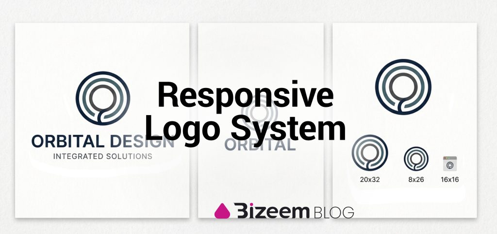
What is a responsive logo system? Simply put, a responsive logo system is a set of connected logo variations designed to adapt to different screen sizes, shapes, and print spaces without losing brand recognition. Instead of shrinking one static image down until it breaks, you swap in a simpler, cleaner version of your logo as the available space gets smaller. Just like a modern website rearranges its layout to fit both a wide monitor and a narrow phone screen, adaptive logo design ensures your brand looks sharp everywhere it shows up.
Why does having multiple logo lockups matter so much today? Because people interact with your business across dozens of different touchpoints every single day. A visitor might see your full brand mark on a sales page, spot your circular profile badge on social media, and click your tiny favicon in a crowded browser bar. When every placement uses a logo version built specifically for that space, your business looks polished, trustworthy, and easy to recognize at a glance. It is also one of the main building blocks behind a complete scalable brand identity that grows with your business.
Why One Single Logo No Longer Works
Years ago, a business only needed a logo for a storefront sign, a business card, and a letterhead. Those spaces were predictable and gave your design plenty of room to breathe. Today, most of your brand impressions happen on small screens where every single pixel counts.
If you force a complex logo with thin lines, intricate icons, and a long tagline into a small square box, two things happen:
- People cannot read your name: Tiny text becomes fuzzy or completely illegible on mobile devices.
- Your brand looks amateur: Cropping a wide logo into a square avatar often cuts off the edges or leaves awkward empty white space above and below your design.
The 4 Core Parts of a Responsive Logo System
A complete responsive logo system usually includes four main tiers. Each tier strips away a little more detail as the space shrinks, while keeping the core colors, shapes, and style consistent.
1. The Primary Logo (Full Lockup)
This is your flagship design. It usually includes your full brand name, your main icon or symbol, and your tagline or founding year. Because it carries the most detail, you should only use your primary logo where you have plenty of space, such as your main desktop website header, pitch decks, brochures, and large banners.
2. The Secondary Logo (Compact Lockup)
Your secondary logo removes the tagline and rearranges the remaining pieces to fit tighter spaces. For example, if your main logo is wide and horizontal, your secondary version might stack the icon on top of the brand name, or place a shorter wordmark next to a simplified symbol. This works well for mobile website headers, email signatures, and medium-sized web banners.
3. The Submark or Brand Badge
A submark is a compact, self-contained version of your logo, often shaped inside a circle, square, or shield. It might combine your initials with a small design element from your main logo. Submarks are made for tight, symmetrical spaces like social media profile pictures, watermarks, merchandise tags, and footer stamps.
4. The Favicon or App Icon
This is the smallest and simplest piece of your responsive logo system. At 16×16 or 32×32 pixels, there is zero room for text. Your favicon or mobile app icon should be a bold, stripped-down version of your main symbol or a single stylized letter. Even at the smallest size on a smartphone screen or browser tab, users should still be able to tell it belongs to you.
If you currently only have one flat logo file and want to expand it into a full set of responsive variations, our custom logo design service can build every lockup and size you need so your brand stays sharp across web and print.
3 Rules for Building Adaptive Logo Variations
Creating four versions of your logo only works if they clearly belong to the same family. Keep these three rules in mind when putting your system together:
- Keep Core Visual Anchors Consistent: Your colors, main font style, and signature shapes should carry through from the biggest lockup down to the smallest icon. If your primary logo uses bold rounded corners and a specific shade of blue, your submark and favicon need those exact same traits.
- Redraw, Do Not Just Shrink: Never make a favicon by simply dragging the corner of your main logo down until it is tiny. To keep small icons legible, you often need to thicken the lines, increase the spacing between shapes, and remove tiny decorative details.
- Deliver Everything in Vector Formats: Every single variation in your logo kit should be built as clean vector art and saved in formats like SVG, EPS, and PDF alongside transparent PNGs. Vector logo files scale infinitely without losing quality, whether you are uploading a crisp SVG to your website header or printing a massive trade show display.
7 Common Mistakes to Avoid With Responsive Logos
Even when business owners build multiple logo variations, a few simple missteps can still hurt their visual consistency:
1. Relying on AI Logo Generators for a Complete System
AI tools can quickly spit out a single flat image, but they fail when you need a real responsive logo system. They generate raster files with messy geometry, random spacing, and inconsistent line weights that fall apart when you try to create matching submarks or tiny favicons. Building adaptive variations that actually work across every screen size requires intentional human design and clean vector paths.
2. Using Too Many Different Colors
If your main logo is blue and orange, your submark is solid black, and your favicon is green, people will not connect the dots. Stick to one unified color palette across every variation, plus clean black and white versions for dark or busy backgrounds.
3. Making Variations Look Like Unrelated Brands
Removing details as a logo gets smaller does not mean inventing a brand-new symbol. Every smaller step should feel like a natural zoom-in on your primary logo so customers instantly recognize your business whether they see your full header or a tiny mobile icon.
4. Forgetting Light and Dark Backgrounds
A responsive logo system is not just about size; it is also about contrast. Make sure every logo lockup has a dark version for light backgrounds and a light or white version for dark headers, footers, and photos.
5. Simply Shrinking the Main Logo Instead of Redrawing It
Dragging the corner of your primary logo down until it fits a 16×16 pixel browser tab turns thin lines and small text into an unreadable smudge. True responsive icons are redrawn with thicker strokes, simplified shapes, and extra breathing room so they stay crisp at tiny sizes.
6. Ignoring Clear Space and Padding Rules
When you move a logo into tight mobile headers or circular social media avatars, text and borders often crowd the edges. Every logo variation needs built-in padding around it so other page elements never touch or squeeze your brand mark.
7. Exporting Only Flat PNG or JPG Files
Saving your variations solely as standard image files locks you into fixed sizes that turn blurry when stretched. Every piece of your responsive logo system should be exported as clean vector files like SVG and EPS alongside your PNGs so they stay sharp on everything from retina screens to large banners.
Frequently Asked Questions About Responsive Logo Systems
Do I need to redesign my current logo to make it responsive? Not necessarily. If you already have a main logo that you love, a designer can usually keep your primary lockup intact and create a matching secondary logo, submark, and favicon around it.
What file formats should be included in a responsive logo package? At a minimum, each logo variation should be saved as an SVG (for crisp websites and apps), an EPS or PDF (for high-resolution printing and future edits), and a high-resolution transparent PNG (for quick uploads to social media and documents).
How many logo variations are too many? For almost every small business or online platform, three to four variations are plenty. Having more than five or six versions usually creates confusion and makes it harder to keep your branding consistent across different pages and platforms.
Wrapping Up
A responsive logo system takes the guesswork out of placing your brand anywhere online or in print. Instead of forcing one rigid graphic into spaces where it does not fit, you give every platform, screen size, and marketing channel a logo variation built specifically for that job. Setting up these adaptive lockups early saves you from blurry icons, awkward cropping, and constant design fixes as your business grows.

Leave a Reply