
Most bloggers treat blog graphics as decoration. They are not. The featured image gets slapped on at the last minute, the Pinterest graphic gets skipped entirely, and then everyone wonders why an article that took four hours to write ends up with twelve views.
NOTE: This post is part of our community contributor series, sharing real-world experiences from vetted digital marketing and development professionals. All views and technical approaches expressed are those of the individual author.
Here is the uncomfortable truth: your graphics are the first thing every potential reader sees. In a Google results page, a social feed, or a Pinterest board, nobody reads your headline first. They see the image, and in about one second their brain votes: worth my click, or not.
The good news is that you do not need a design degree to win that one-second vote. You need Canva’s free plan and five repeatable decisions. This is the workflow I teach beginners, built for business owners and marketers, not designers.
1. Design blog graphics for the 1-second test
Open any social feed and notice your own behavior. You scroll past dozens of images per minute, and you stop for maybe one in fifty. That stopping decision happens before conscious thought. It is driven by contrast, clarity, and curiosity.
Before you export any blog graphic, shrink it down to thumbnail size and look at it from two feet away. If you cannot instantly tell what it is about, a stranger scrolling at full speed will not either. This one-second test catches 80% of click-killing mistakes before they publish.
The fix is almost never “make it fancier.” It is “make it simpler.”
2. Readable beats pretty, every time
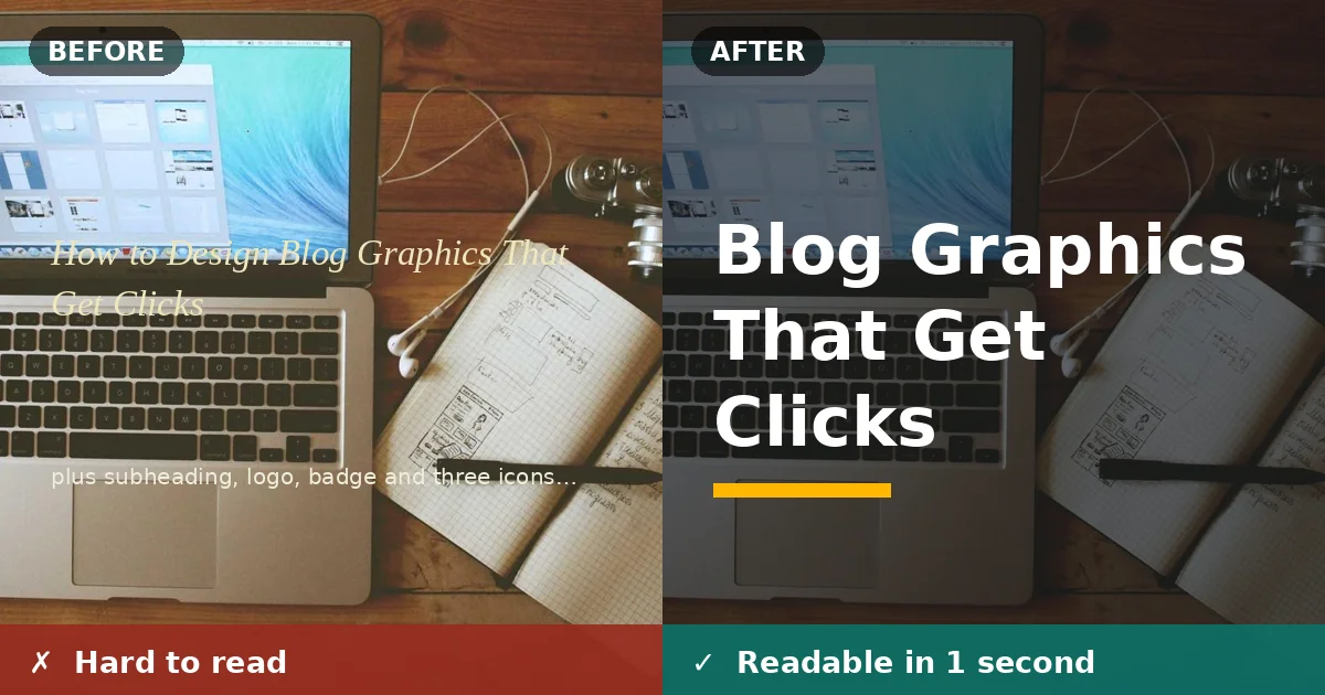
The most common reason a graphic fails is text nobody can read. Beginners layer thin, elegant script fonts over busy photos and call it branding. In a thumbnail, it becomes gray mush.
Three rules solve this permanently:
- One bold, heavy font for the main message. Weight beats style for readability.
- A dark overlay behind light text (or the reverse). A 40 to 60% black rectangle behind your headline turns any busy photo into a readable background in ten seconds.
- Six words or fewer on the headline. A thumbnail is not a subtitle field.
If you want the exact technique for making text pop off any background, here is a click-by-click walkthrough: How to Outline Text in Canva for Bold, Polished Designs. The outline trick takes about a minute and is the single most-used text technique in my own tutorial graphics.
Sometimes the photo itself is the problem. If your subject is drowning in a cluttered background, remove the background altogether and place the subject on a clean brand color instead. The graphic instantly looks calmer, and your text gets room to breathe. It is a two-minute job once you know the clicks, and this step-by-step guide to removing a background in Canva covers the free workaround as well as the one-click Pro tool.
3. One blog graphics, one message
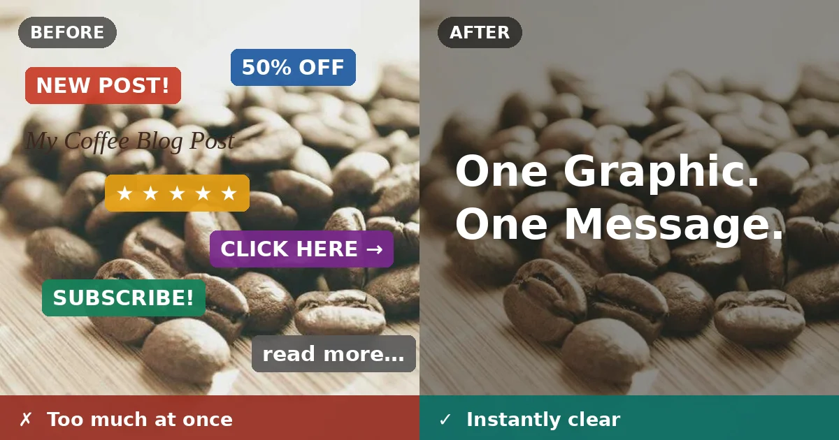
A second click-killer is the collage instinct: the headline, the subheadline, the logo, three icons, a badge, a photo, and a decorative divider, all competing inside one frame.
Think of your graphic like a billboard on a highway. A driver gets three seconds; a scroller gets one. Billboards that work carry one message in seven words or less. Your blog graphic should do the same.
Practical version: before you add any element, ask, “Does this help the click?” Your logo in the corner? That helps recognition, so keep it, but keep it small. The decorative swirl under the headline? That helps nothing. Delete it. Ruthless deletion is the fastest design skill a non-designer can learn.
4. Give the eye one place to land
Even a simple blog graphics fails if the viewer’s eye does not know where to go first. Designers call this visual hierarchy. For everyone else it means one thing: make the important thing obviously important.
In practice, the headline should be 3 to 4 times the size of everything else on the graphic. Not slightly bigger. Dramatically bigger. Size contrast is the cheapest way to create hierarchy, and beginners consistently underdo it because it feels like “too much.” It is not too much. It is exactly what a one-second scan needs.
Second place goes to one supporting visual: a single product shot, one icon, or a simple shape. Two visuals start an argument; one visual ends it.
5. Size it right for each placement
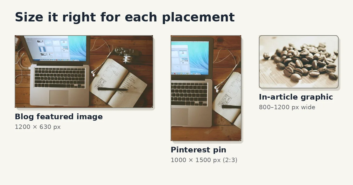
A beautiful blog graphics in the wrong dimensions is a broken graphic. Canva’s presets exist for exactly this reason, so use them instead of guessing:
- Blog featured image: 1200 × 630 pixels, the size social networks expect when your link gets shared.
- Pinterest pin: 1000 × 1500 pixels, the 2:3 ratio Pinterest’s algorithm favors.
- In-article graphics: match your blog’s content width, usually 800 to 1200 pixels wide.
The single biggest beginner mistake I see is designing one square graphic and forcing it everywhere. The Pinterest version of your article deserves its own vertical design. Taller graphics dominate Pinterest feeds, while a horizontal featured image shrunk into a Pinterest board looks like a postage stamp. Fifteen extra minutes in Canva, double the traffic surface.
6. Make every graphic recognizable as yours
Clicks compound when readers start recognizing your graphics before they read your name. That recognition comes from boring consistency, not from brilliant one-off designs:
- The same two fonts on every graphic. Pick a pair that works and stop re-deciding.
- The same 2 to 3 brand colors, used the same way each time: one for backgrounds, one for headlines, one for accents.
- The same layout pattern. Headline position, logo position, and image treatment barely change from post to post.
Canva’s Brand Kit (the free plan includes the basics) stores these decisions so you are not remaking them every time. One template for your featured images and one for your Pinterest pins, reused weekly, will do more for your brand than any single “amazing” design.
Your 10-minute blog graphics workflow
Steal this checklist for every new post:
- Pick the placement and its exact size: featured image, Pinterest pin, or both.
- Write the 6-word headline for the graphic. Not the article title, the click hook.
- Choose one background photo and add a dark overlay for text readability.
- Set the headline in one bold font, 3 to 4 times larger than anything else.
- Add one supporting visual and a small logo. Delete everything else.
- Run the 1-second thumbnail test before exporting.
Blog graphics are not decoration. They are the door to your content. Design the door well, and the words inside finally get the readers they deserve.

Leave a Reply